Bridge
Bridge is an exciting and creatively open brand to work with, offering a great deal of design freedom and room for innovation.
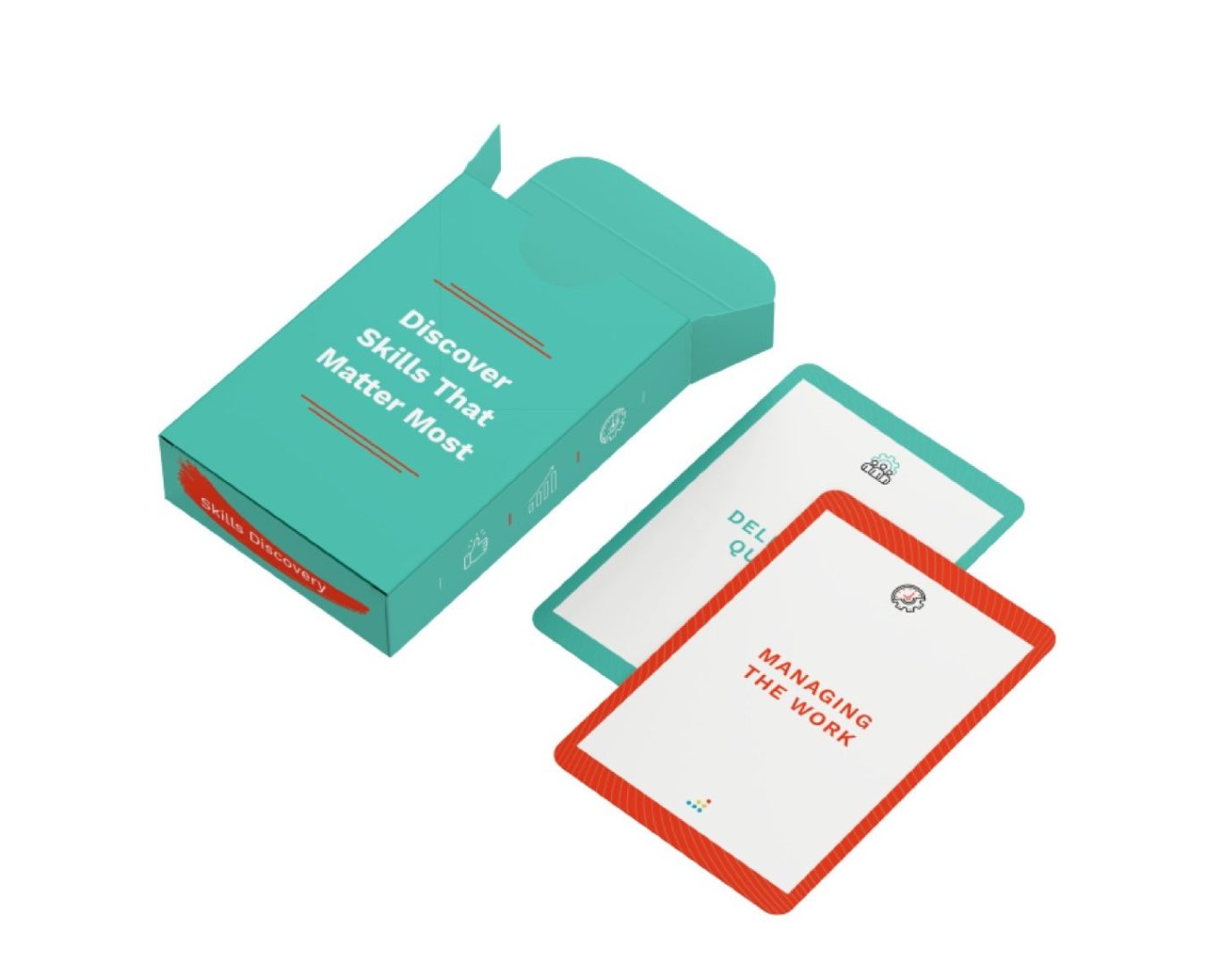
One standout project involved the creation of Career Driver Cards, designed specifically for use at expos and industry events. These cards were intended to be handed out to prospective clients as an engaging and informative way to highlight the unique benefits that Bridge offers.
The design focused on clarity, visual appeal, and tactile quality - creating a physical product that stood out in a sea of digital communications. The cards were well-received, with client feedback being overwhelmingly positive. Many commented on how much they appreciated the tangible, interactive format, which helped reinforce Bridge’s commitment to meaningful, people-focused experiences.
This project showcased how thoughtful design can not only communicate value but also create memorable brand interactions.
.
LTG
This presentation deck was designed for LTG and was created to be both informative and visually engaging, showcasing best practices in layout, typography, and production. The design reflects LTG’s brand identity while maintaining clarity and structure, making complex content easy to digest for a range of audiences.
.
Patchwork Health
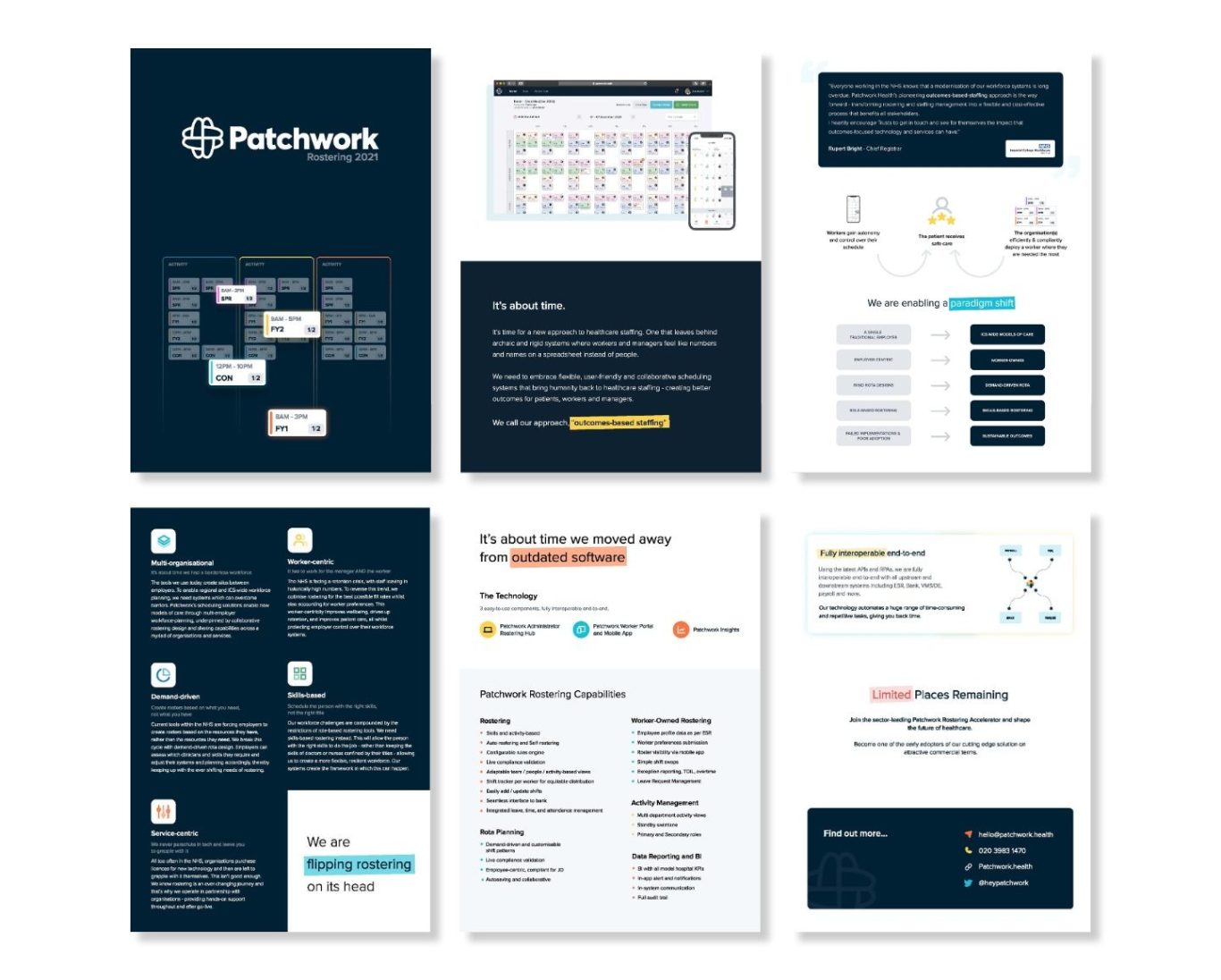
This brochure was designed for Patchwork Health to be distributed at expos and industry events as part of their promotional materials.
Its primary purpose was to showcase the brand’s clean, modern design while effectively communicating their services to prospective clients. The layout was carefully crafted to reflect clarity, professionalism, and approachability - key values at the heart of the Patchwork Health brand.
With a strong emphasis on visual consistency and minimal, impactful design, the brochure was created to stand out in a busy event environment and leave a lasting impression on its audience.
PeopleFluent
This presentation deck was created using the updated brand guidelines recently developed by the creative team I’m part of.
The design focused on clarity, consistency, and presenting information in a way that was both engaging and easy to digest. Every element—from typography to layout—was aligned with the refreshed visual identity to ensure a cohesive and professional look throughout. The result was a clean, modern deck that effectively communicated key messages while reinforcing the updated brand direction.
.